Enter the playful

universe of Staysville

Enter the playful

universe of Staysville

Enter the playful

universe of Staysville

Macbook on stairs showing the frontpage of the Staysville website

Client

Staysville

Client

Staysville

Client

Staysville

Agency

Fasett

Agency

Fasett

Agency

Fasett

Development

Værsågod

Development

Værsågod

Development

Værsågod

Photography

Tom Haga

Photography

Tom Haga

Photography

Tom Haga

Product photography

Sara W. Karlsen

Product photography

Sara W. Karlsen

Product photography

Sara W. Karlsen

Staysville is the new name of MMKS Eiendom, who owns and rents out a series of apartment hotels in Stavanger. It's a family-owned business, run by a pair of siblings with strong family values and a high service minds who goes out of their way to make guests feel like home on their stays.

It started out as a normal name, identity & website project, but along the way we found some magic; we uncovered the Staysville universe. A universe filled with unique characters and history, carried through the logo, the tone of voice, and the website itself.

My main role was as lead designer for the website, with a more advisory role in the identity process — contributing early concepts and ongoing input, while the identity design itself was led by Trond Fernblad in Fasett.

Staysville is the new name of MMKS Eiendom, who owns and rents out a series of apartment hotels in Stavanger. It's a family-owned business, run by a pair of siblings with strong family values and a high service minds who goes out of their way to make guests feel like home on their stays.

It started out as a normal name, identity & website project, but along the way we found some magic; we uncovered the Staysville universe. A universe filled with unique characters and history, carried through the logo, the tone of voice, and the website itself.

My main role was as lead designer for the website, with a more advisory role in the identity process — contributing early concepts and ongoing input, while the identity design itself was led by Trond Fernblad in Fasett.

The goal for Staysville was simple: get bookings. That meant making listings easy to find, which meant the search and calendar bar needed to be available at any time, without dominating the page. We looked at how booking sites like airlines, Google, and Booking.com handle this, but wanted something with more personality than a search bar sitting in your face on load. That's where the search blob came from.


It had two jobs: be visible the moment the page loads, so people know it's there, and then "hide" in a playful, noticeable way that still makes it easy to find again later. To check whether that hiding spot was actually intuitive to someone outside the project, I built a prototype and ran an internal think-aloud usability test, watching people try to find a listing and narrating their thought process as they went.

Graphic element on dark green background
The text "Staysville* The best place you've never been* *unless you've been here before" on a beige colored background.
A list of type information on an orange background. The type information is Times New Roman and Vesterbro Light, Regular, Medium, Bold, Extrabold and Poster.
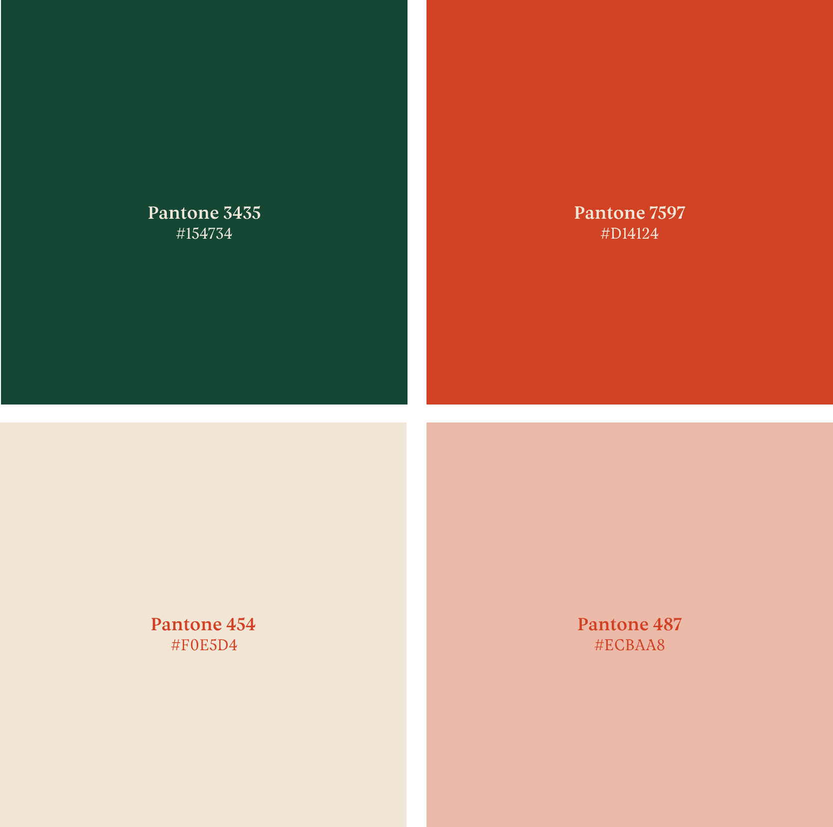
Four squares showing the color palette with text written on each square informing of the proper hex code and Pantone code for each color.

The playfulness of the Staysville identity embeds everything in it and its universe. From the colours, to the shape of the logo, the tone of voice, the merch (yes, there is merch) and last but not least the website. It all has an edge to it, a unique sense of humour that brings the story of Staysville to everything in it.

The listing page of the Staysville webpage on a bright orange background
An iPhone mockup with the listing page of the Staysville webpage showing listings available. On a beige background.

Easily find your next stay whether you’re on a mobile device or on a desktop device. With a toggleable map on mobile devices, and on desktop it will jump to location as you scroll down the page of listings, pretty neat, right?

A man sitting on a brown sofa holding an iPhone showing the frontpage of the Staysville webpage.
The frontpage of the Staysville webpage on a beige background.

The brand's orange is core to the identity, but it doesn't meet accessibility contrast standards at most text sizes. So as a background color, it only appears in one place: the hero, where the text is large enough for it to stay accessible. That's also where the logo mark's scroll animation lives, so we’re keeping the brand orange were it matters. Everywhere else on the site, including the search blob, I created an adjusted "web orange" to take over, paired with either white or beige depending on context. Both combinations meets contrast requirements for body text.

Two hands holding an iPhone showing a listing page from the Staysville webpage.
The search blob element on a bright orange background.

A closer look at the search blob, as we so lovingly started calling it throughout the process. On mobile devices it is available on the bottom of the screen through thumb swipe up for easy access.

A closer look at the search blob, as we so lovingly started calling it throughout the process. On mobile devices it is available on the bottom of the screen through thumb swipe up for easy access.

The Guide to Stavanger page from the Staysville webpage on a bright orange background.
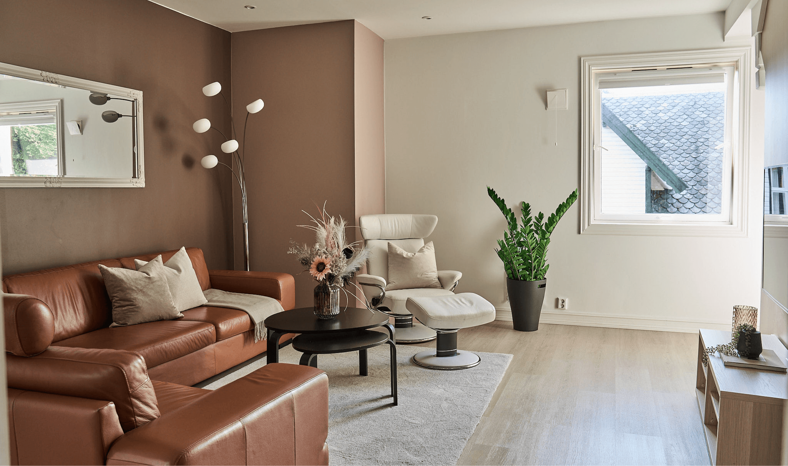
An image from one of the apartments. Showing a livingroom with a brown leather sofa, a black coffee table and a white lounge chair. A tall green plant in the center and a tall lamp in the corner. A window to the right. There is also a carpet on the floor and one of the walls are painted brown.
An iPad showing details from the listing page from one of the apartments from the Staysville webpage. The iPad is laying on a grey sofa.
A Macbook on a pink stand showing a listing page from the Staysville webpage.
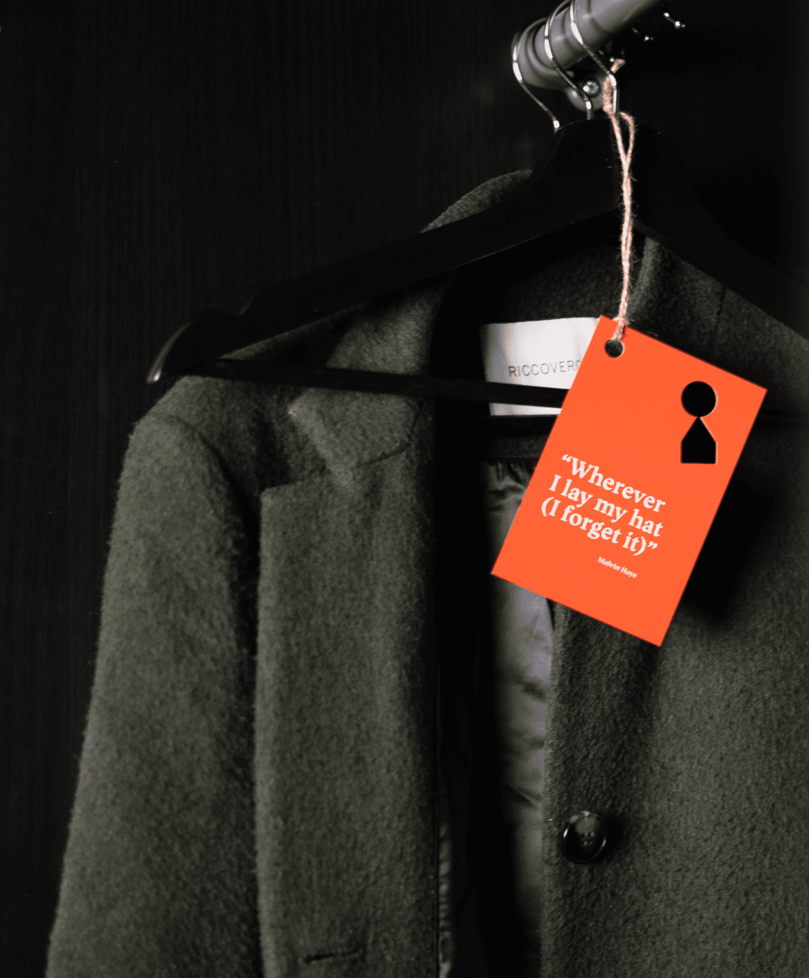
A wintercoat hanging in a closet with an orange tag attached to it with a keyhole punched out in the shape of the logo of Staysville and the text "Wherever I lay my hat (I forget it)".
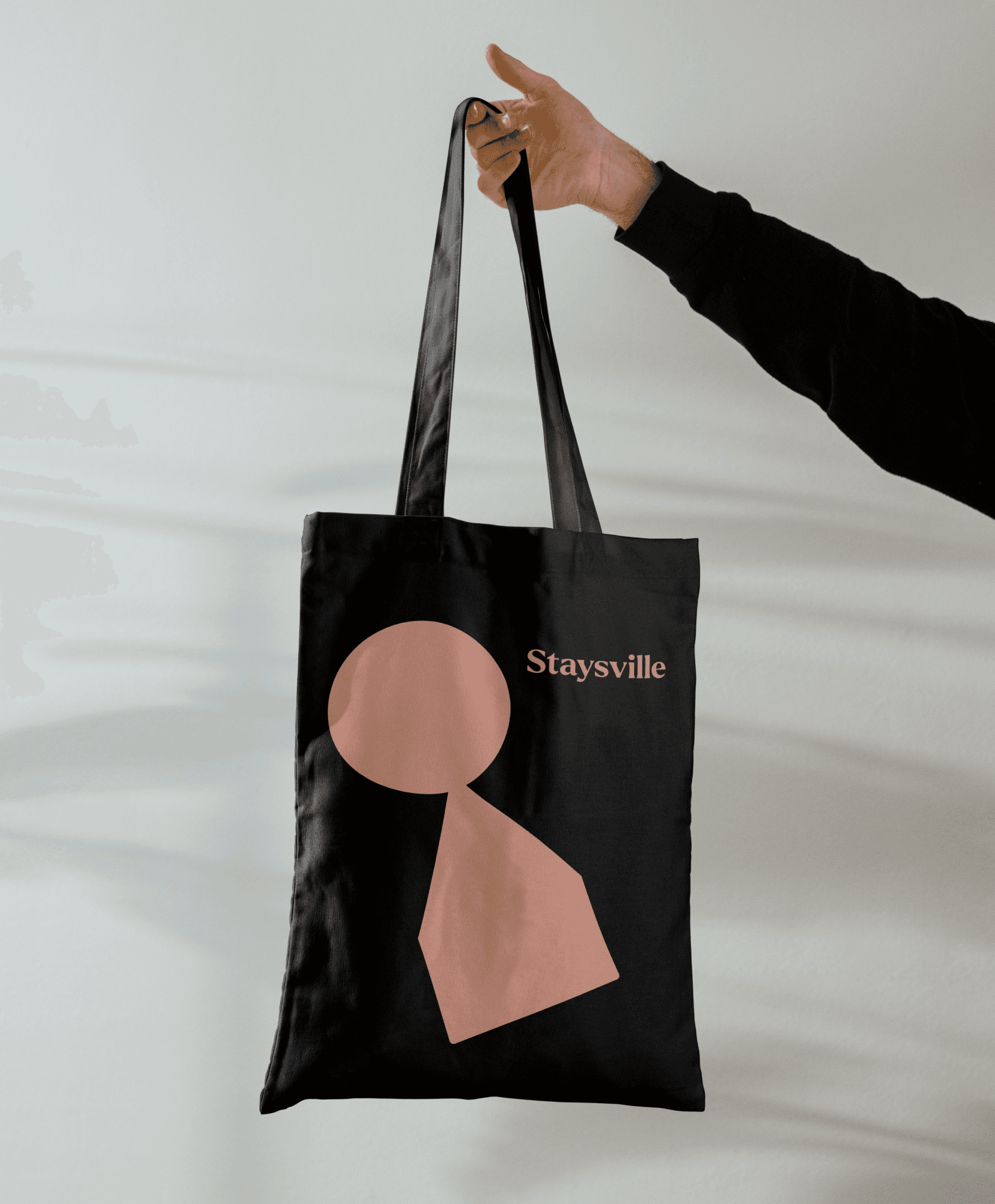
A hand holding a black totebag with the Staysville logo on it in pink on a white background..

The brand's playful edge carries through to merch too; totebags, apartment cards with in-world stories and quotes. (And yes, you can buy the umbrellas).

A black half-closed umbrella with a pink tag with a ouncheed out keyhole in the shape of the Staysville logosymbol and the text "I recommend this anti-humidity device in case of moisture falling in a descending vertical direction" and a QR code on it. The umbrella is laying on top of a green pouf next to a wallpapered wall with a leaf pattern in white.

Of course these are just the highlights and I'd love to show everything, but that's simply not possible. The site is live at staysville.no, and Fasett has a more in-depth write-up of the whole project if you're curious.