Sval Energi is a Norwegian energy company that started small in 2019 and has grown to become a significant player on the continental shelf.
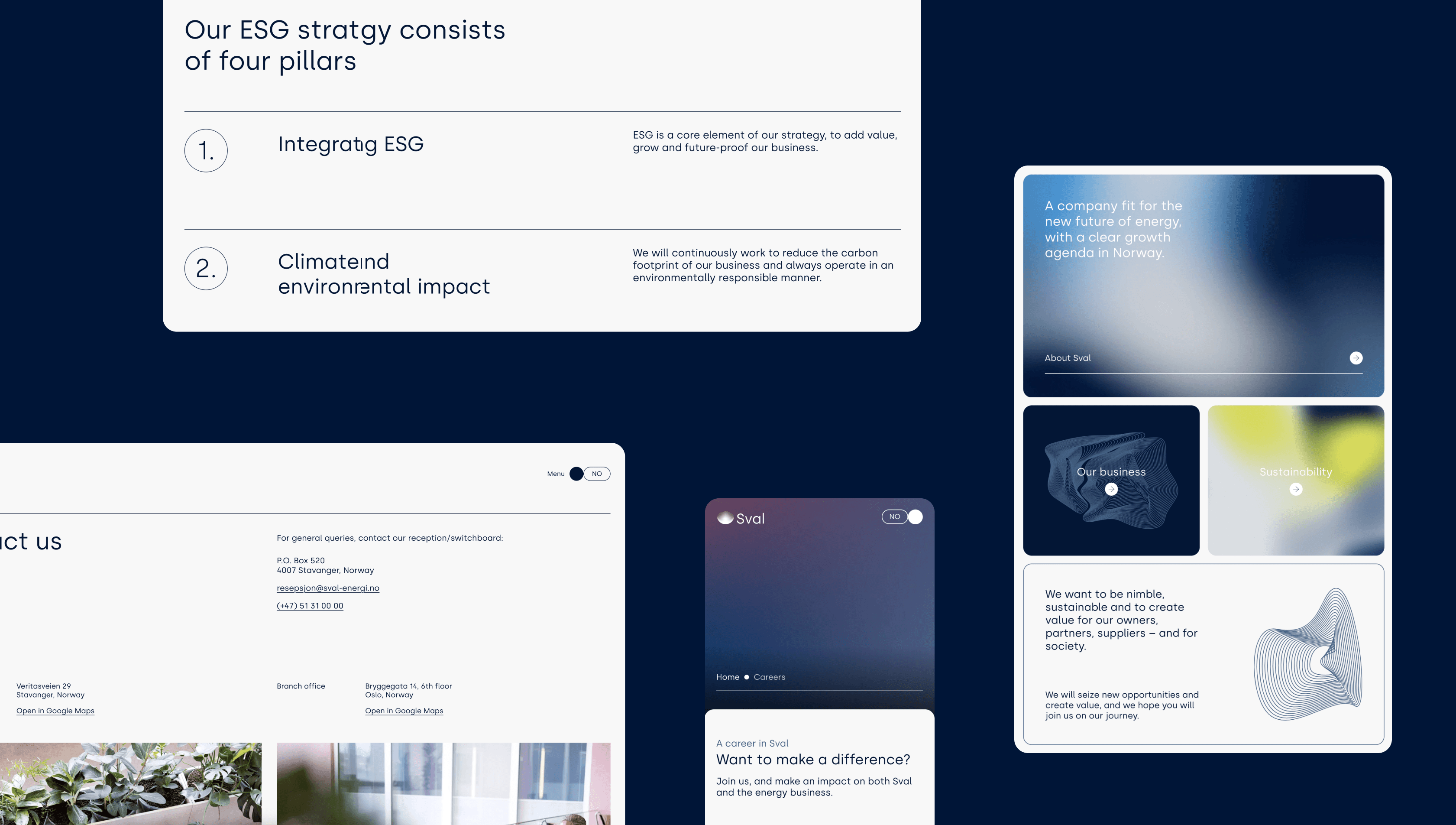
Their existing website didn't reflect their new vision and strategy, and needed an update to better fit their organisation. Easy navigation and a clearer structure were a priority for the client. They also wanted us to look into lowering the site's carbon emissions where possible.
The brand itself needed a bit of a refresh as well. The whole direction of the company was steering in a new direction so everything was indeed changing. Except for one very important thing; the logo.
I was the lead designer on this project, responsible for both the identity and web design work. Making the final calls on structure, visual direction, and interaction. The concept and design decisions were mine, shaped along the way with input from my team lead. Validation was informal throughout: client feedback and internal review, rather than structured user testing.
Note: Sval Energi has since been acquired; site shown reflects the 2022 design. This page shows an archived version of the site at the time.

Adjusting the palette from light, soft tones to darker, heavier, more serious colors in a slightly monochrome scheme, with two accent colors used sparingly where contrast is needed. All color combinations were checked against WCAG AA contrast standards before finalizing, since the darker, more saturated palette risked readability issues if left unchecked.


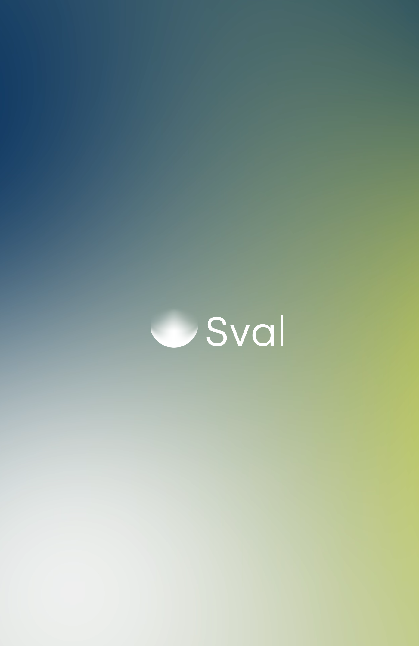
Inspired by the logo gradient, seismic data, cartography, gas and other things relevant to their business the idea to using gradients as the go-to for graphics came to. With endless opportunities for moving or still gradients to use in just about everything.

Detailed wireframes before final design sketches to make sure the structure and hierarchy are properly planned.



All lists on the site have both a list-view and a picture/card view, to accommodate different user behaviours and needs.


If you are interested in the initial identity and website process when they first launched their original website, Fasett wrote about it here.