Löplabbet is a runners shoes company, run by runners (see what I did there?). They publish two magazines each year, one in spring and one in fall. Both magazines have a print edition as well as a digital version. For this year's edition, they wanted a new look that could continue across future editions while still allowing room for seasonal variation.
The brief was to build a framework the client could take over and manage themselves in InDesign for future print editions, with little to no agency involvement needed going forward, only stepping back in for bigger changes down the line. I worked with another designer on the print version and led the digital version on my own.

My focus was building a modular system: a flexible enough layout framework that the client could swap in a new seasonal color palette and still produce a strong-looking magazine without needing a designer involved each time.
Keeping the print and web versions visually consistent was a priority throughout, and so was making sure the palette held up to accessibility standards. That last point took some careful balancing: finding a palette that stayed true to the brand's seasonal look while still meeting web contrast requirements took a bit of iteration to get right.


Playful and energetic, the magazine is designed to give the reader the same joy of running as the runners behind Löplabbet.


Re-usable modules in the digital magazine for maximum flexibility for future content.

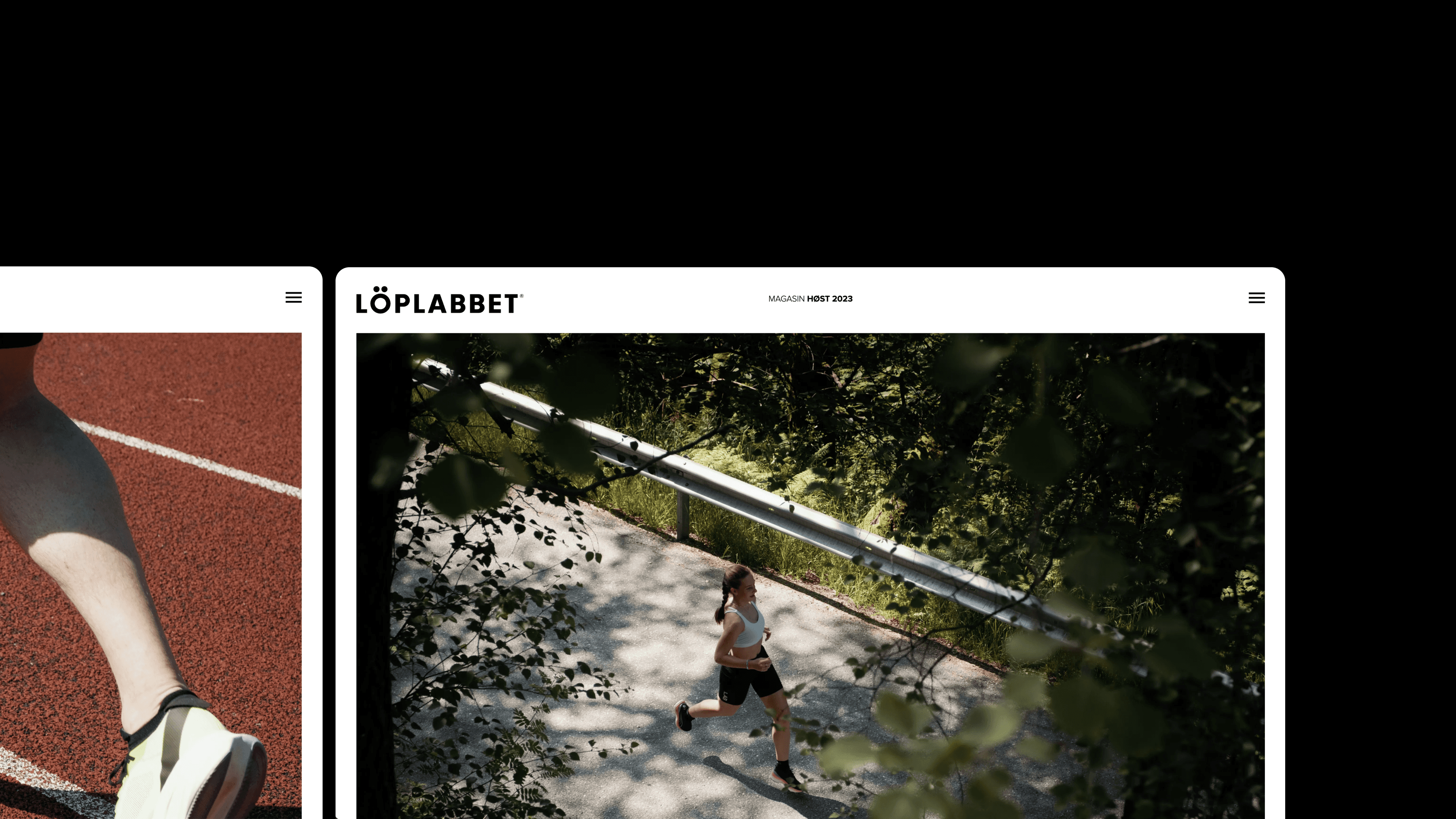
We started with the 2023 spring edition, which carried the bulk of the framework-building work. Not long after that edition's run, the 2023 fall edition put the framework to the test, reusing the same modular system in a new color scheme.

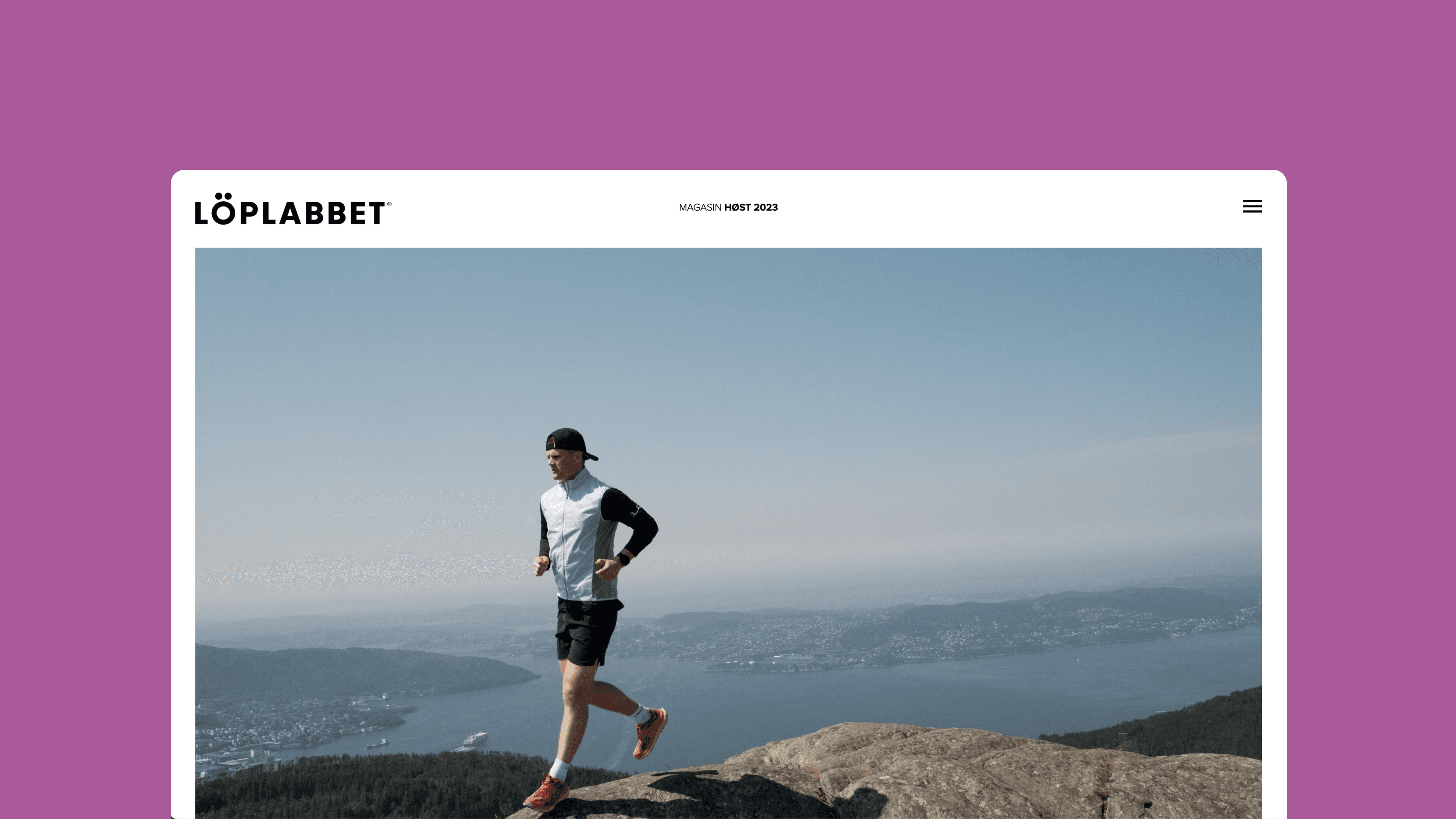

Three years on, Löplabbet is still using the same template and module system for their magazines, a good sign that the framework has held up exactly as intended.
Check out the live magazine at magasinet.loplabbet.no, built in Sanity by the talented crew at Grensesnitt, with content kept up to date by the client themselves.